Brief
I was handed a folder of HTML and PHP files and was tasked with styling it like a 'pro' marketing site – borrowing heavily from an industry of my choosing – over the course of a one-week sprint.

Challenges
Design was definitely the most challenging piece of this project. The goal of the project was to steal from industry peers, but then take that and create something unique, yet familiar. It took lots of feedback and iteration to get it to a place where my design language communicated what I needed it to, while also feeling fresh and interesting.
This project also pushed my knowledge on CSS grid and working with modules – in other words, making sure my scoping was airtight so my styles didn’t leak all over the place.
Process
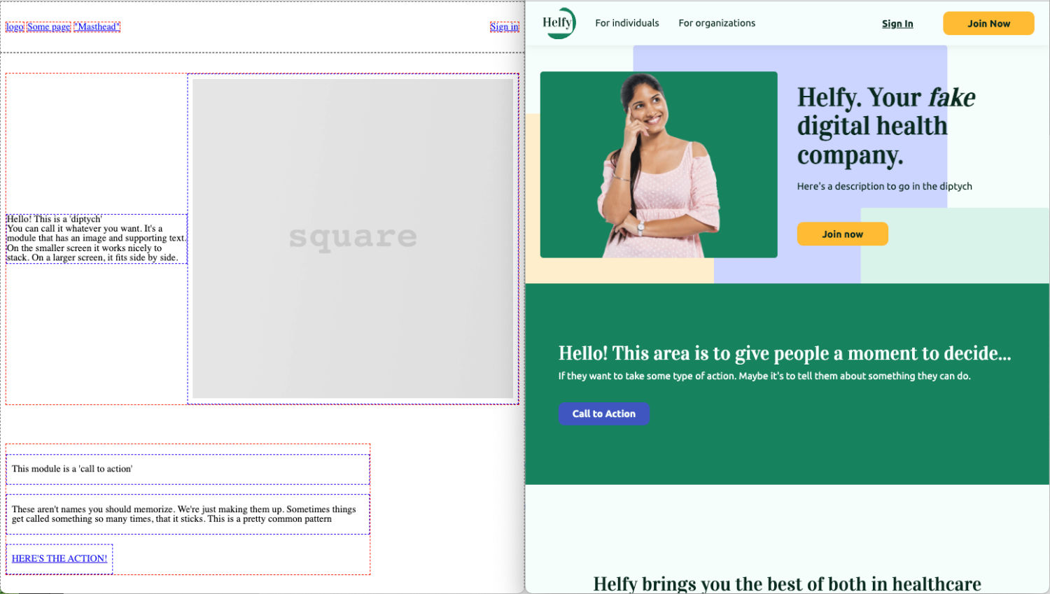
The first step was to write the CSS for the layout, so that I would have a responsive wireframe to work with.
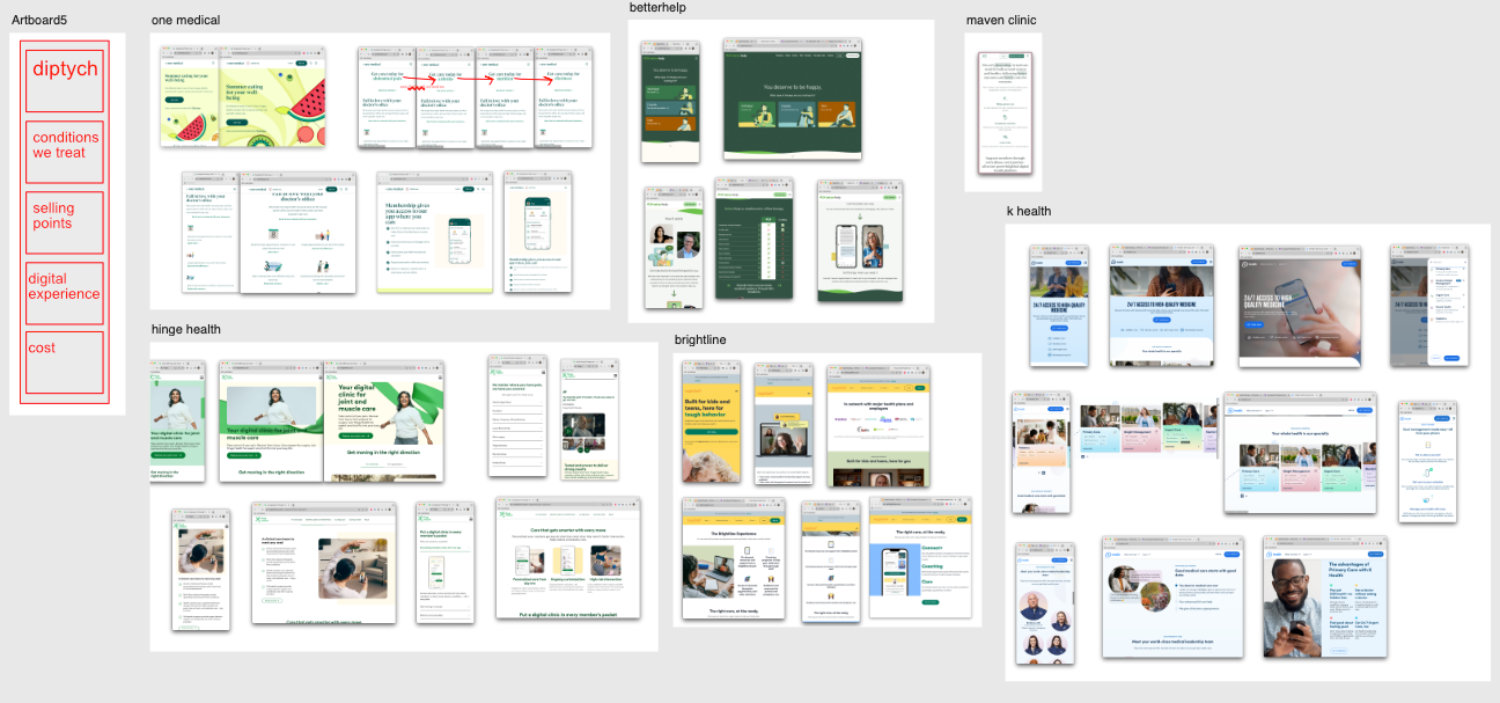
Next, I analyzed 10-15 digital health companies’ marketing websites, and narrowed that list down to a group of 6 favorites to compare their color palettes, brand copy, structure, and overall tone.

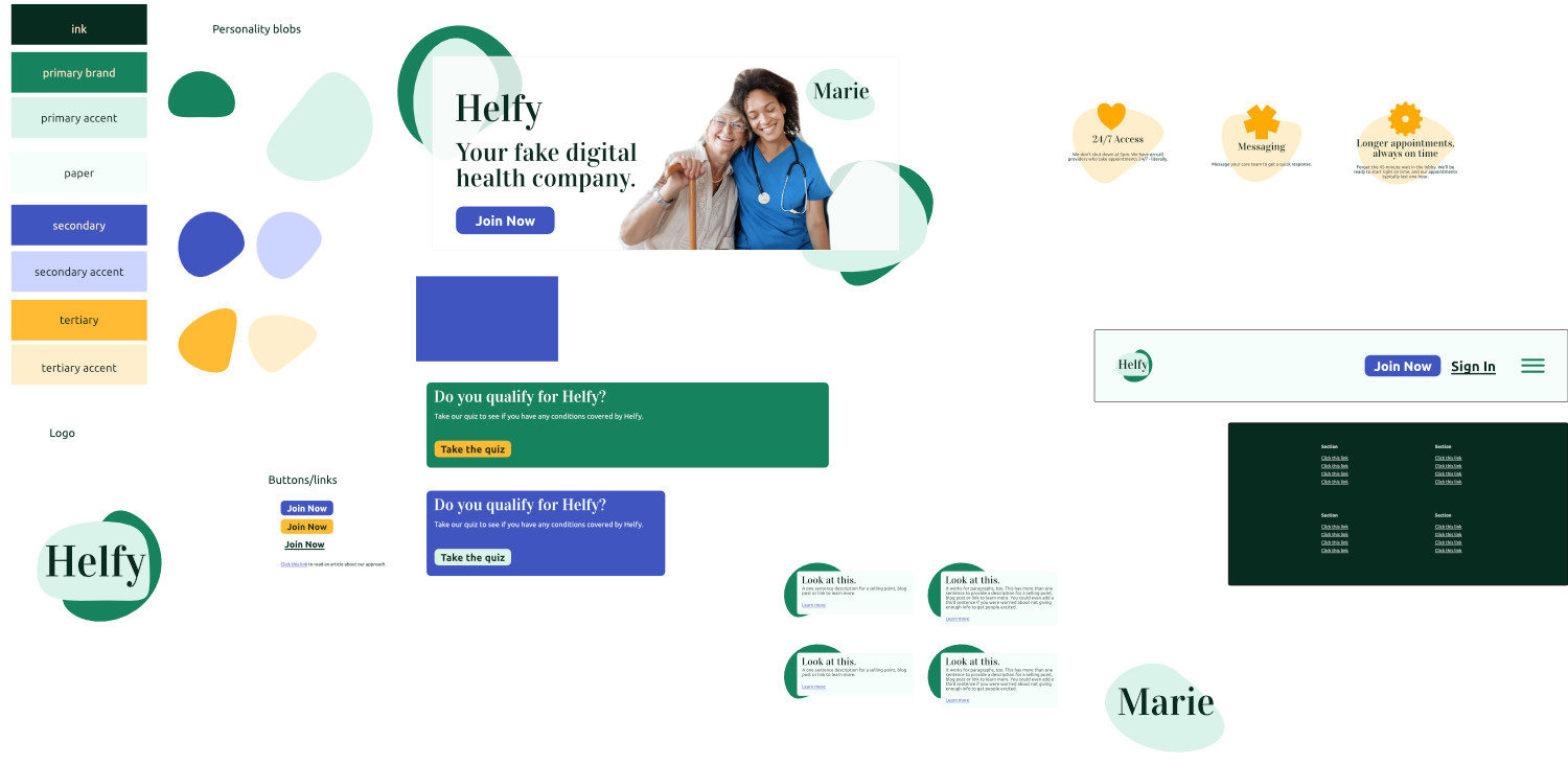
From there, I created style tiles – a loose deliverable that’s used to communicate the overall vision and feeling of a design, with clear definition of typography, color, and some sample modules.

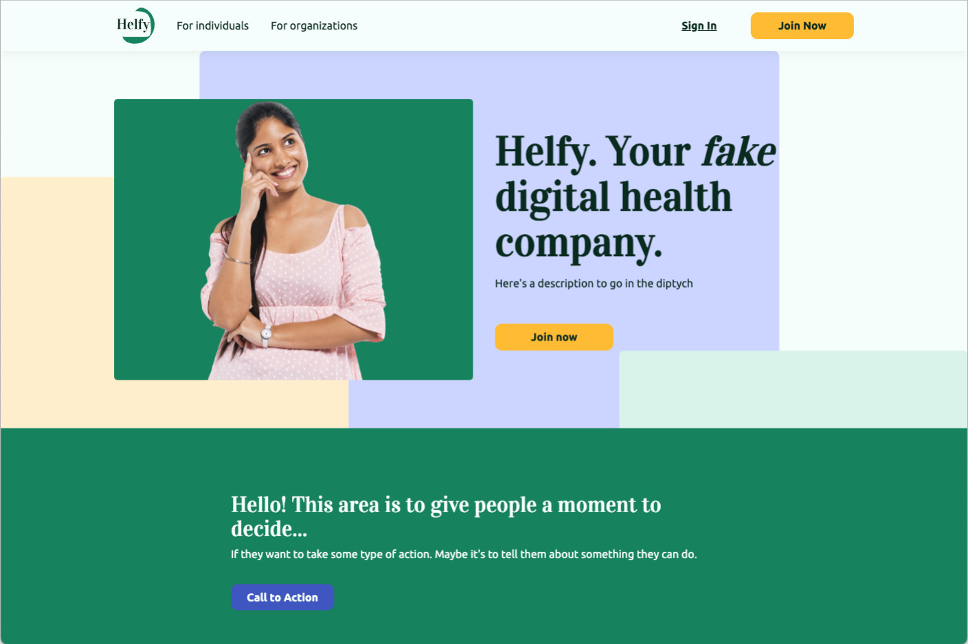
I got feedback from around 7 people over the course of 2 days, and iterated quite a bit on my style tile. At that point, I cranked out the CSS.
I actually finished early – and spent that time creating a brand new module. I wrote the HTML, CSS, and also created a set of icons to use.
Learnings
This project was a test of the prior 2 months of learning the ins and outs of HTML, CSS, typography, graphics & image preparation, and PHP. It pushed my abilities in all of those areas and I learned a lot.
I got very comfortable working with CSS grids, learned the value of modular code and reusable components, creating icons that are optically aligned, and learned how to iterate through design concepts and take an idea from a loose collection of bullet-points to a polished website.
